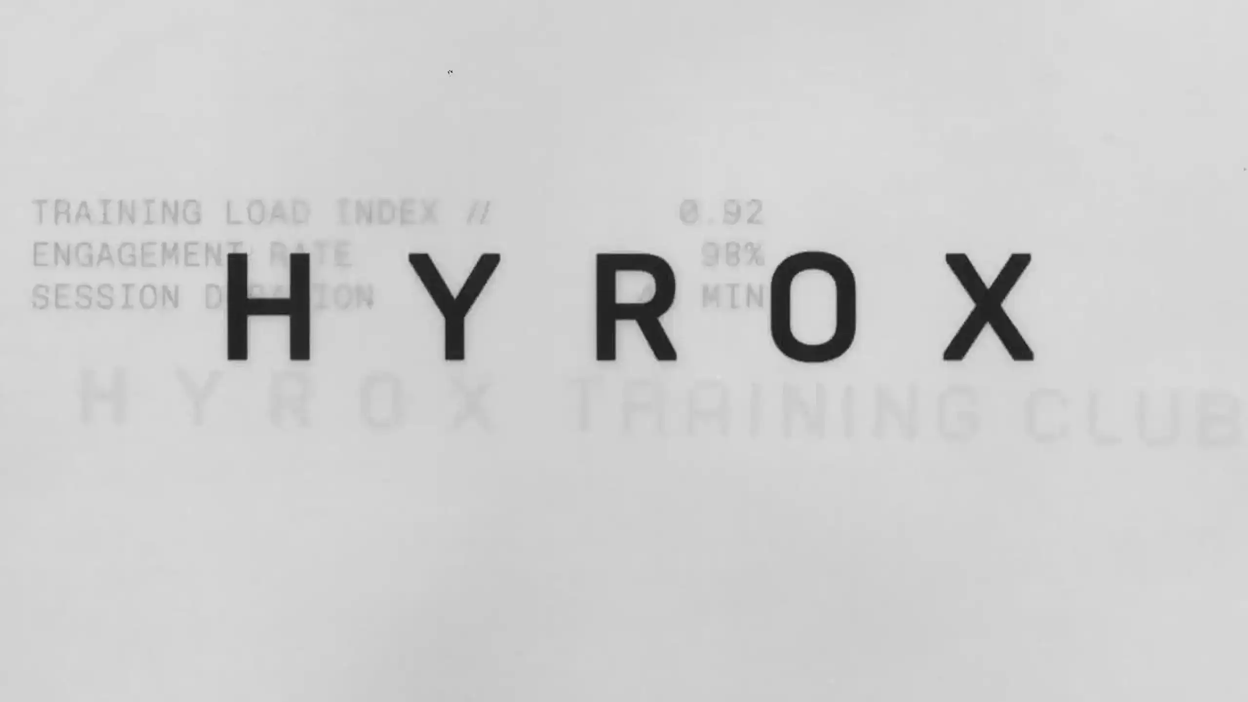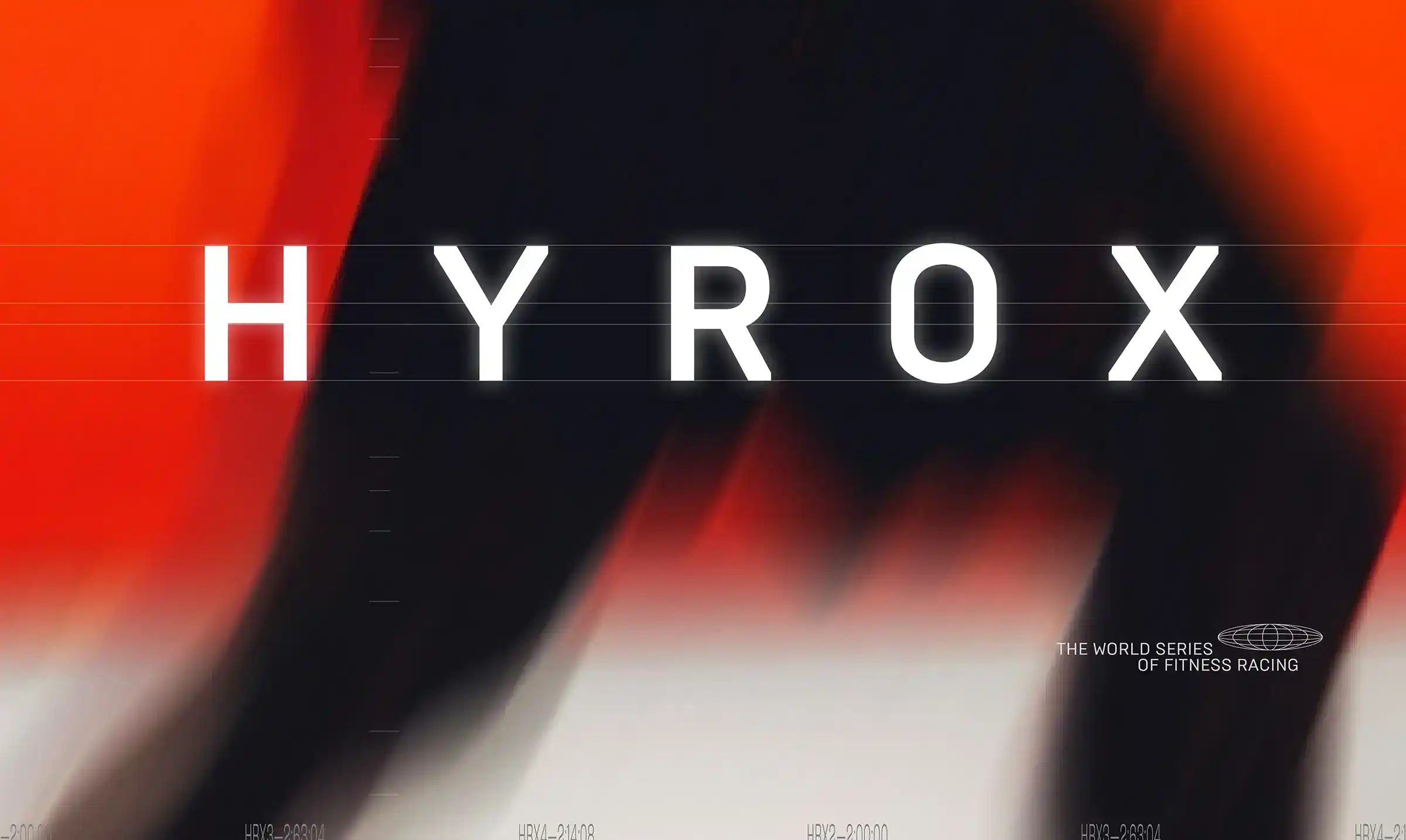
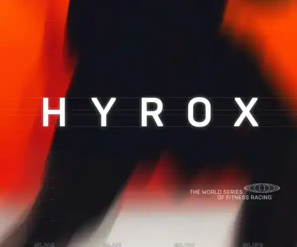
HYROX Training Club
Corporate Design / Typografie / Packaging
HYROX is one of the fastest growing sports brands in the world, based in Hamburg, Germany. Well known for its unique system of functional fitness training and globally staged races. In close cooperation with the HYROX team, Fargo developed the concept and visual identity of the HYROX Training Brand. Built on the core idea of HYROX: movement, functional fitness, being in the moment, and training for something bigger within an everyday context.
The task was to push HYROX forward as a consumable brand for daily training without losing its highly successful brand DNA. The system provides affiliate studios around the world with easy access to a modular design system, visual content, and clear guidelines, making it simple to create consistent HYROX Training Club environments. Motivating the everyday gym user to train and identify with the HYROX community.
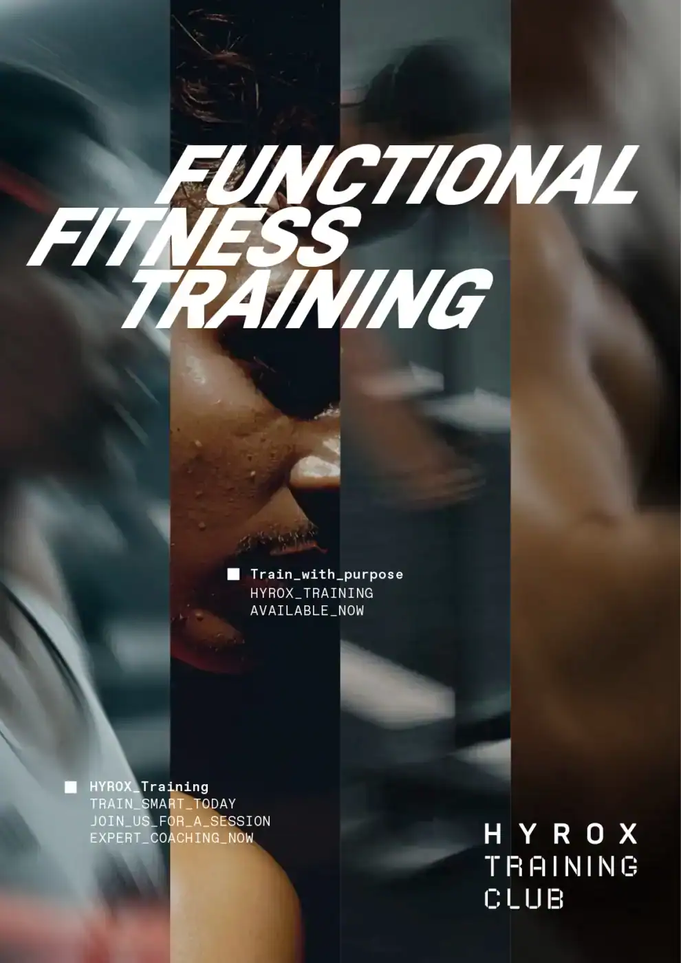
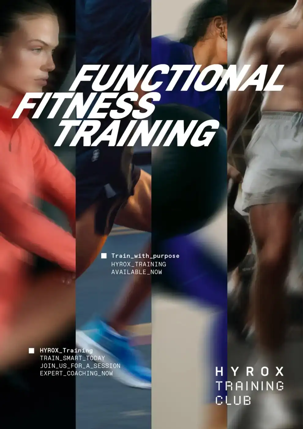
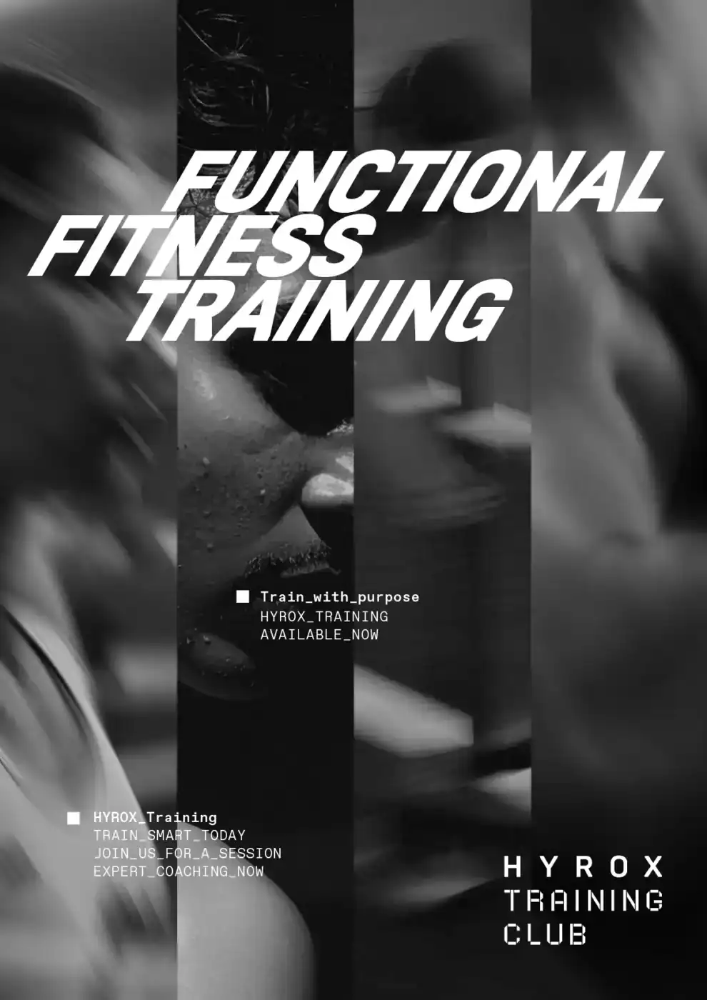
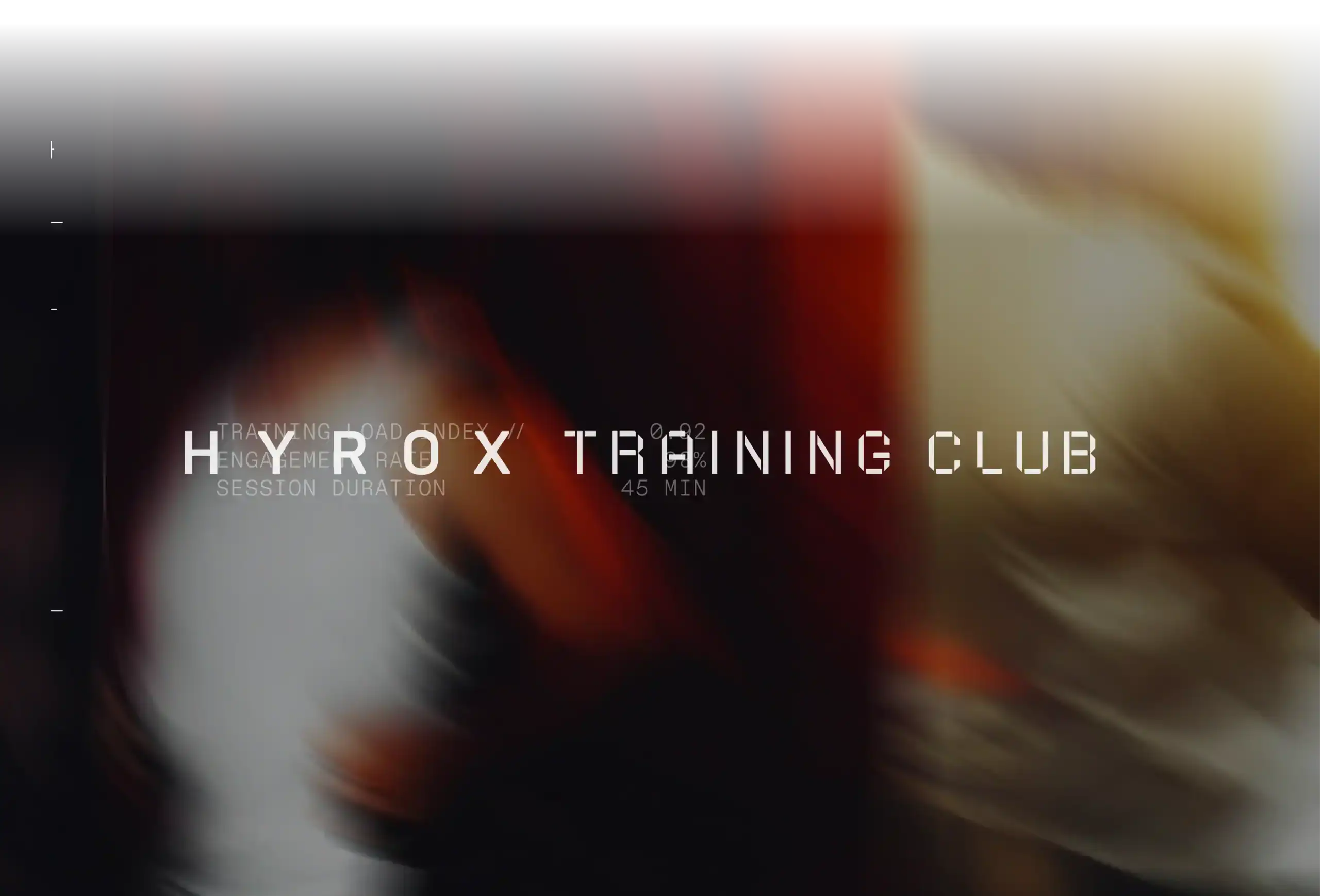
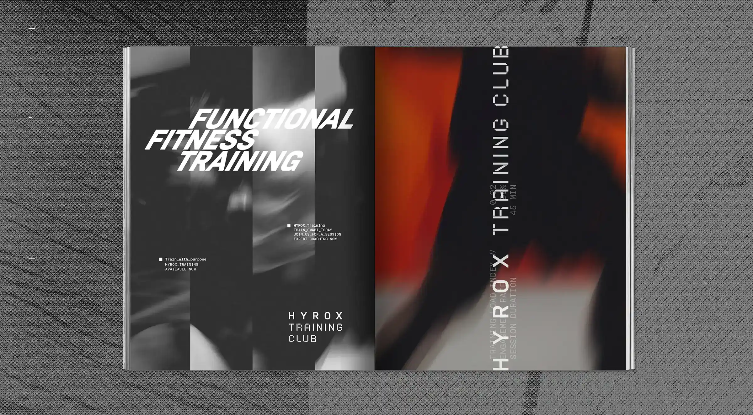
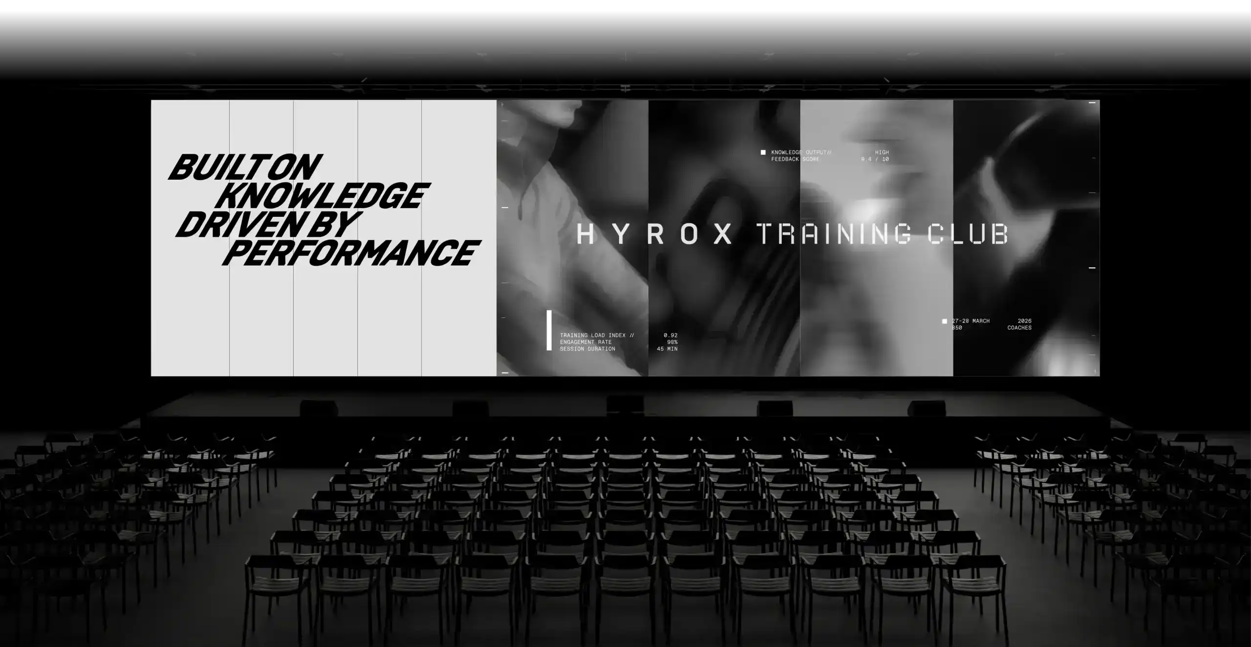
The visual language captures training in action, deliberately unpolished and full of life. Movements aren’t frozen; they flow naturally. Subtle blur, visible effort, and real body posture are emphasized. Imagery features full-body shots or clearly recognizable training situations, often cropped or captured from unusual angles. Close-ups alternate with wide shots, near with far. The result is authentic, relatable, and full of energy. Suitable for website, social media, and editorial content. The clear design grid is based on the “facets.” Vertical image strips whose number corresponds to the sequence of HYROX disciplines and reflects the complexity of the training and athletes. The customized typography, set in tilted italic, contrasts with the emotional visual language. Dynamic, direct, loud, and intense.